Sunday, January 10, 2010

Flash Quick Course - Week1

During the winter break I took a quick course on flash.

We worked on a few projects first I used a picture of Patch that I had to do this one:


The bird flies into the picture and perches on the bird feeder. The only thing wrong with the picture was that I did not use the fill command on most of the drawing (only Patch) so I had to do another picture to show I understood how the fill command worked. I came up with this picture:


We next worked on a banner for a spoof movie, I used the idea from a book I once read "Who moved my Cheese":


We then did a movie of a time bomb counting down from 5 and exploding with a graphic. I have tried to upload it here but I do not have the correct format for this bolg area. I will work on getting it modified, or maybe I will go to another site once I get it up and running.

Our last week we worked on Other videos to use buttons and movement. These were fun to work on and I even drew an animation of a runner to use for a race we did. I hope that I now have a basis for my next course using flash.

Basic Web Scripting

For this class we learned to use the code to build a web site. Using both html and css files. I designed a site for a friend to sell his Brangus Cattle. At this time I am waiting on pictures of the Bulls that are for sale, so when I get those I will put the link to the site here. Sorry it is not ready at this time.

Note: I still have a 4.0 gpa

Screen Design & Graphics

For this class we were to find a web site that needed a face lift. I chose Je'riel Fashions The page loads slow and it is made up of graphics, which is good for a flyer or poster but not for a web site.
Here is a picture of the original site:


We were to make up some modified layouts that we thought would enhance the site I came up with these:


And the one that was desided would be the best to continue on with was this one:


After working with fonts of different types color schemes and the layout this was my end product:

Tuesday, January 5, 2010

Extra Credit

Luckily we were given the chance to do extra credit for the Design and Typography course. Here are a few tutorials I did for the class:


So I ended up with an A for the course. With overtime at work and such an intense course it was good that extra credit was offered. I learned many things about fonts that I took for granted before this course.

Monday, January 4, 2010

Design and Typography week 6 Taxi Driver Final

The finished product; Taxi Driver StoryBoard:


As you can see I ended up using only fonts to convey the graphics.

Design and Typography week 6 Taxi Driver

We are tasked to make a story board for a movie. I chose Taxi Driver.

Here are my storyboard sketches:

Design and Typography week 5

So here are my designs for the saying that I went with:


Ending up using the last one in the list.

Design and Typography week 4

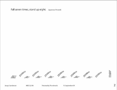
For our next assignment we had to make pictures using fonts in a way to show a saying. These are what I came up with:


Design and Typography week 3

For our next project we were to make a grid based on an artist I used Piet Mondrain for the grids and the fonts are Nick Curtis'


So I ended up with this design;

Design and Typography week 2 next project

For this project we weere to come up with a chairity to prmote and design a poster with fonts. As you can see I have added graphics to some of mine. Which was not a good thing.


After I finally understood that we were to only use type (I am a brick wall sometimes). I came up with this:

Design and Typography week 2

We then had a project to show the anatomy of type using one of the previous examples we submitted. I came up with this:

Design and Typography

This class was a bit hard for me at first, I wanted to draw but we had to use fonts for everything. You will see what I mean as the weeks progress.

First we had to diagram fonts and match sayings to fonts


I thought I did pretty good on this, but I did not read the directions as they were written. Each one of the examples needed to be 8 x 10 not all the examples in an 8 x 10 area. Points were taken off for this.

Information Design

During this class we were able to do power point presentations about a topic we liked. My younger sister was on my mind and I thought about Tinker Bell. So I did a presentation using a few pictures that I had taken, a song clip that I downloaded, and another picture of Julia Roberts as Tinker Bell in the movie Hook. I also wrote up information for different sites that told about Tinker Bell. At the end of the presentation I had all references listed. I thought it was pretty good and the comments I got on the project were good also. I received an A on it.

For the final we had to put together a deliverable package for a web site we were to develop. I chose a forum for Multiple Endocrine Neoplasia. We had all the information in either a PowerPoint presentation or printed documents to be delivered to a client.

Here is the title page:


I learned allot, and still I maintain a 4.0 GPA

Week6 Viola Music Web site

Well I received an A for my efforts on my web site. When I post it to a server I will add a link to it.

Week5 more practice

We learned how to import flies from software and the Internet into web pages. Practicing with examples form our book and incorporating things into our own projects. We have been working on our sites every week to get input from the class on what is liked or disliked so that we can make a better site by the end of next week.

I also asked a few people for their opinion on my design by giving them the address to view what I had been working on.

Many thanks go to my sister who gave me many critiques to get my design to work better.

Week4 Cascading Style Sheets

During this week we learned that there is more than one type of file to make an internet site function. We practiced a few things using the different types of files all written with notepad but saved with the different extensions.

Week3 Fundamentals of Internet design

During this week we studied about tables and began to write code using Notepad, that would be read by Internet Explorer or other search engines. It was a good week, and brought back memories of codeing with basic. I remembered more than I thought I would.

Week2 Fundamentals of Internet Design

We worked on web site plans; what colors to use, how items would be laied out, what areas are more important than other areas (prime real estate). Wire frames, logic diagrams, and what type of people would be using the site. All this to set the mood for the site.

There were many things to take into account before we could really start with the design.

Decision on what my web site would be

I could not really think of anything unique for my web site design attempt. So I figured what kind of site would I like to have available? Well I came up with a site that would supply updated melody music for viola players. I wish this could really be a site but with copyrights and all I could not get the proper approvals to have the music online. So this is just a site in my head not on the Internet.

Fundamentals of the Internet

Starting a new class on Fundamentals of the internet.

So after setting up an area to post a web site on the school servers and doing an autobyography and of course reading and answering questions and interacting with others online for all of the above week one was finished pretty easily.

Grade update May 11, 2009

So far I have been able to keep my grade point up at 4.0 with much hard work and time put into the assignments. I am enjoying what I am learning and hopefully I will be able to use all of it in my future.

Final for Colory Theory

For the Final I used this image:


Along with this artist statement:

For my final project I intended to come up with a design that would “take you away” from the everyday stresses that we face. By using color combinations and effects that were introduced in the last five weeks of study, along with the other courses that I have covered since starting my adventure at AI-online.

I feel that I have met the goals I intended to accomplish with the design that I have submitted. I feel the design gives off a peaceful feeling; therefore one could escape from the pressures of the day when looking at it. I have used Blues to invoke thoughts of fantasy with peace and sensitivity, and violet for its playfulness, as our reading for this week explained.

When looking at the design your eyes are drawn into the center by the pointing of the stars and diamonds into the whirlpool effect of the background. Variety comes in with the different colorings of the stars, having opposites across from each other, for a different look at the same colors. Contrast is shown by the two different rings seeming to be layered over each other. And balance is found in the circular form of the design.

The color harmonies that I used in this design are; analogous 2 for the stars, split-complementary for the diamonds, and pentagram for the background. You can see the transparency in the layered star (polygon) in the center; I gave the top layer a twist and opacity of 84%. Depth is noticed with the spiral and the stars seeming to be pulled into it. And vibration occurs if you concentrate on the center of the design; the diamonds seem to move slightly. Overall the design has a peaceful aura that one could look at all day and let your mind wonder.

The challenges that I encountered were to get the design balanced with a good effect of depth. I feel I was able to get a balanced effect using a few different color schemes together within the design, by using the illustrator color schemes board as a starting point. I then went to Photoshop and played with different effects until I found one that looked just right to me, for the layout of the stars and diamonds as well as the background.

At this point I really do not see anything that could have been improved more than I have done. But that does not mean that there is not room for improvement, in classes to come I may learn something else that I could have used on this design. I have heard that designs are an ongoing process, they can change daily.

Jacqueline